

ULTRON is an energy drink brand. Derived from
'Ul' - Ultimate & 'Tron' - Medium, Ultron is the tool for ultimate energy.
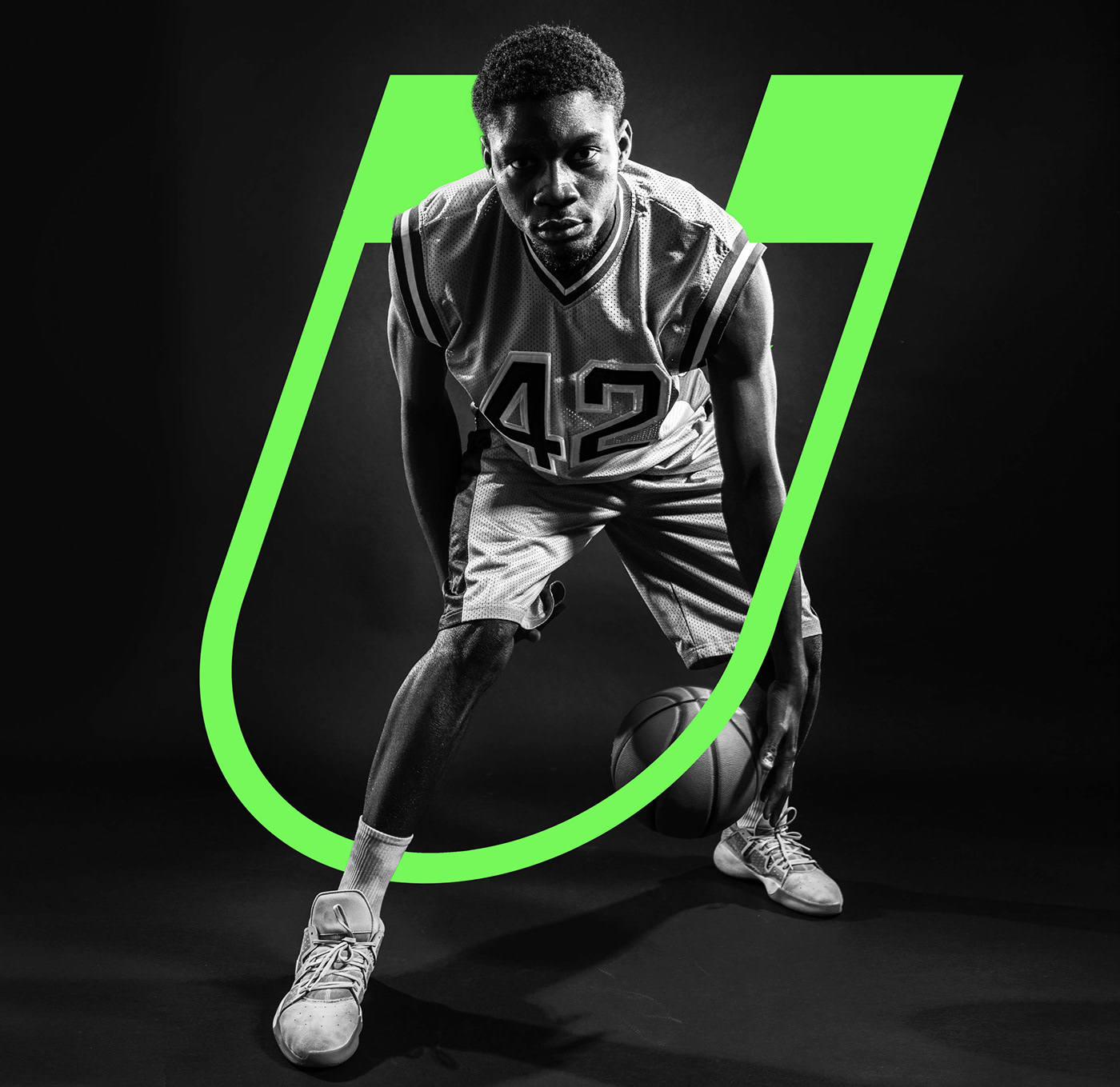
The elements in the logo are a magnet and a lightning bolt, where the magnet signifies attraction and power, while the lightning bolt depicts speed and energy. Neon colours are selected for energy drink branding because of their boldness and connection to vigour and enthusiasm, enhancing visibility and attracting younger consumers with their dynamic appeal. This deliberate choice of colour aids in establishing a distinct brand identity amid fierce competition.


CULTIVATING GREATNESS
Ultron is for coaches who cultivate greatness. In the arena of sports, coaches are the backbone. The campaign celebrates their coaching excellence, acknowledging their dedication. Ultron empowers coaches to stay sharp and focused because when coaches thrive, champions emerge.


